Role - UI/UX designer
Tools - Figma, Notion, Gather
TechScrum is a project management system, whose core users are small-mediums size businesses. The system allows users to manage projects from professional practices, and track and understand the real situation of users’ projects in a short time to prevent project delay. Meanwhile, the system provides an analysis system that allows users to analyze their past projects.
Meanwhile, the system allows users to invite and manage access rights based on RBAC (Role-Based Access Control) mechanism with no credit.
I joined the Tech Scrum Team at the second stage of development, and my priority task is to design of existing pages and pop-up windows based on the design they have at the moment and create a style guide for developers for reference. Weekly meetings are held with a Business Analyst and the Product Owner to ensure the project is on track and collect feedback on the design.
-
Layout
-
The first ticket I was assigned is to redesign the layout of the Dashboard Page. I created two different layouts and forwarded them to the Team meeting to let Team member choose their preferred layout.
-
Considering a project management system might include a range of features in the future, and require a clear structure. We decided to use the second layout based on the voting results.
-

-
Colour
-
After deciding the layout of the Dashboard, I started with deciding the project theme colour. I did brainstorming and research online and created three colour schemes.
-
We decided to use Blue as our main theme color during the weekly meeting.
-

-
Pop-up windows
-
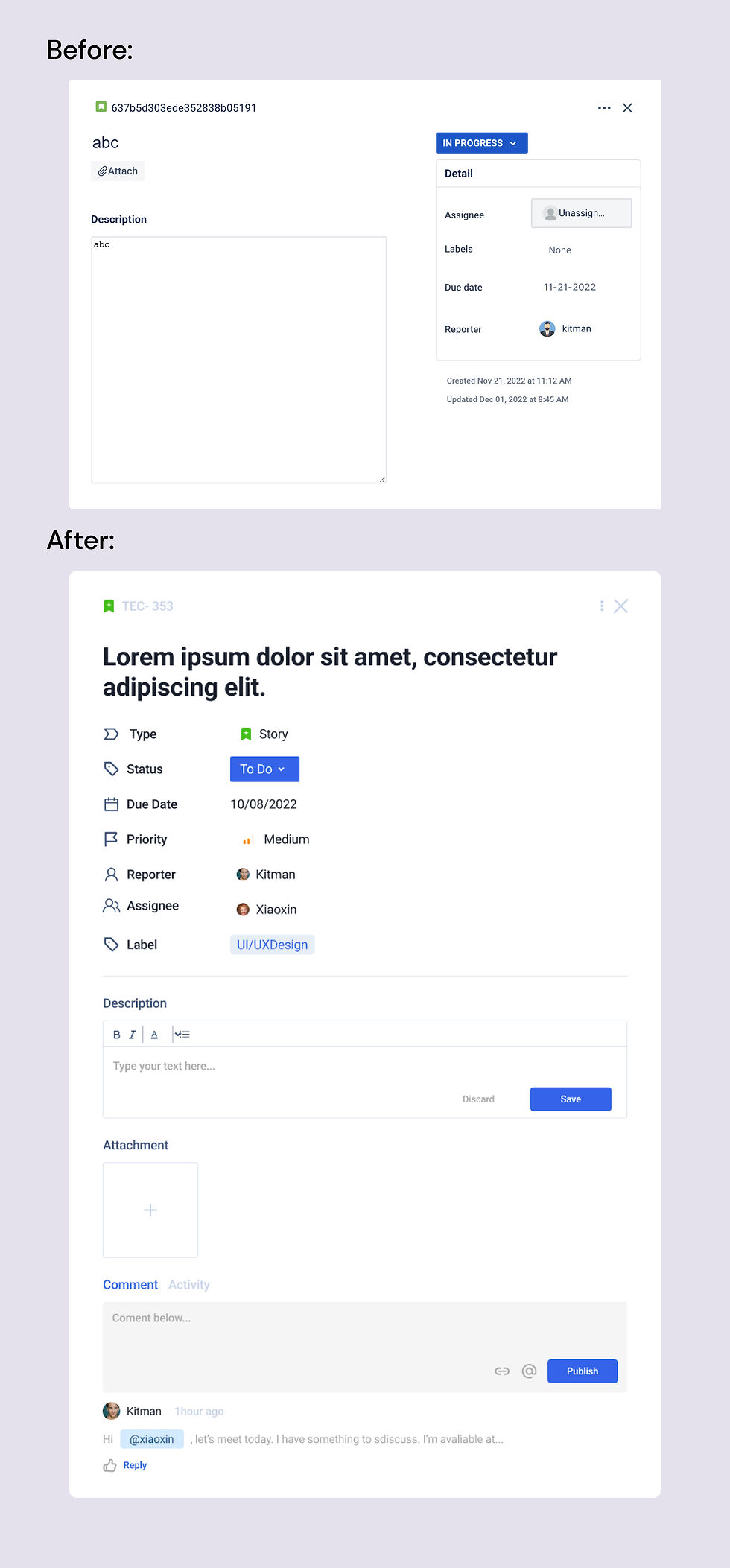
Some layout of pop-up windows is redesigned to create a more logical structure for users to create or update project tickets.
-

-
We invited 20 developers who are currently working in the industry to try the newest release of the interface design.
-
Around 60% of the developers agreed current design is clear for them to organise their project without any instructions, but some of them also mentioned that the current design is quite similar to JIRA. They suggest changing color theme and layout may help to solve this problem.
According to the collected feedback, I had a meeting with BA and the Product Owner. and we decided to improve the design and make it more unique so that can stand out in the market.
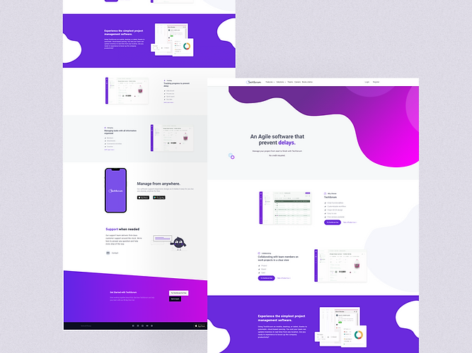
To differentiate from JIRA, I decided to try the Purple and Green colour scheme and also applied different layouts.

To keep the consistency of the landing page and purple match the tone of technology, we decided to apply purple as our main theme colour. Also, we had a detailed discussion about the layout during our weekly meeting, and the Product Owner mentioned Tech Scrum may not provide as fully comprehensive functions as JIRA, as some of the functions are seldom used by developers.
Thus, we decided to go for the second design on the left-hand side. Also, I utilised curved lines to create a sense of flexibility and dynamic.
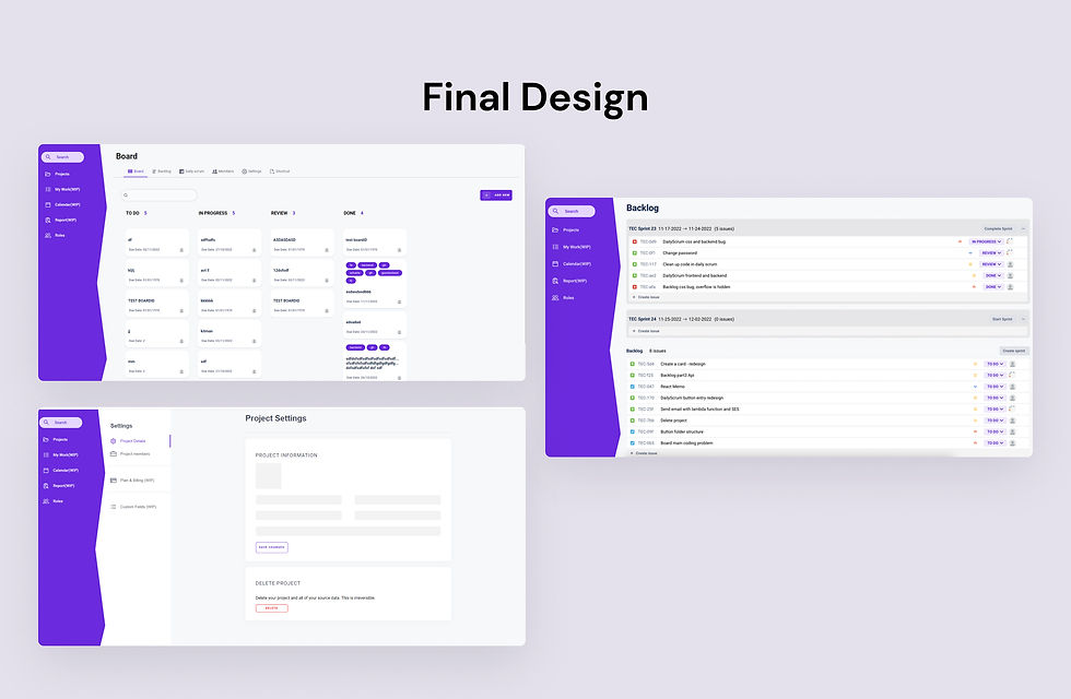
This project is quite challenging for me because Tech Scrum has a showcase, 4 weeks after I join the team. I needed to deliver the main pages of key features and made them stand out in the presentation. Also, there are numerous project management systems in the market such as JIRA. I not only need to keep the uniqueness of Tech Scrum but simplicity as well.
What I learnt from this project is that colour and layout of an interface will have a huge impact on the look and feel of a product. As a designer, I should do more practice on colours and layout to consolidate my design skills in the near future.