Role - UI/UX designer
Duration- 6 months
Tools - Figma, Paper and pencil, Figjam
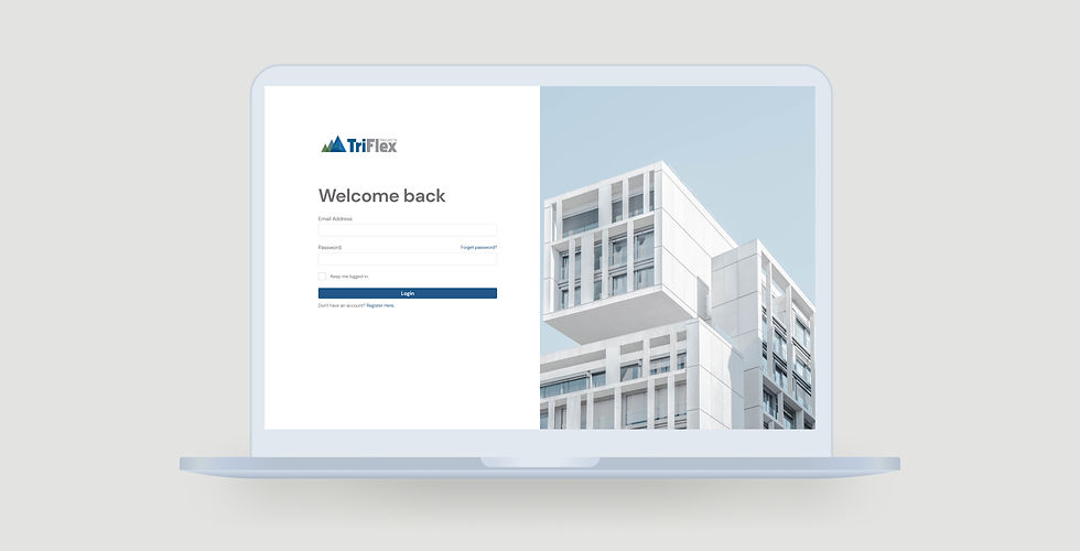
Triflex, a digital Saas Platform, aims to break out information gaps in the construction industry.
It is designed for small to medium size construction companies to share and retrieve real-time online accessible data, preventing inefficient project management due to outdated information. It includes diverse kinds of users such as developers, builders, subbies and investors.
Design Process
The project is divided into the following five phases: Define, Empathize, Ideate, Design, Prototype.
Define
We started answering 5W questions according to the given design prompt by our client.

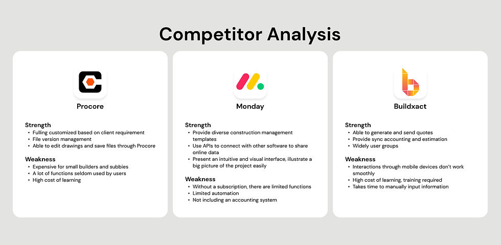
After receiving the given design prompt, we conduct a quick competitor analysis and interviews with experienced construction participants in order to have a better understanding of their pain points and investigate the delayed reasons behind projects. From there, we created user stories to better understand our goals and user needs.
Our main takeaways from this stage include:
-
Simple and effective interaction
-
Real-time information
-
Highlight emergency information
-
Allows person with multiple different roles to perform their tasks
-
Data visualization
-
Compared with other industries, new technology is seldom used in the construction industry.
-
Individuals in construction might be assigned different roles across different projects, with different tasks.
-
The biggest issue Trifelx Project is facing is cash flow management.
-
Diverse individuals with different backgrounds work in construction.

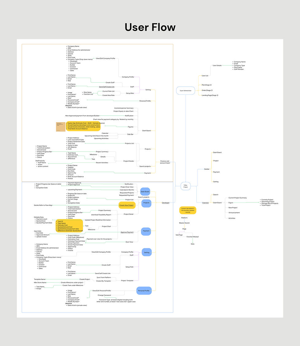
Based on our competitor analysis, interview results and user stories, we determined the essential features of the app to make it more effective and useful. A user diagram is created to map out these features and help analyze what functions would be necessary for the app.

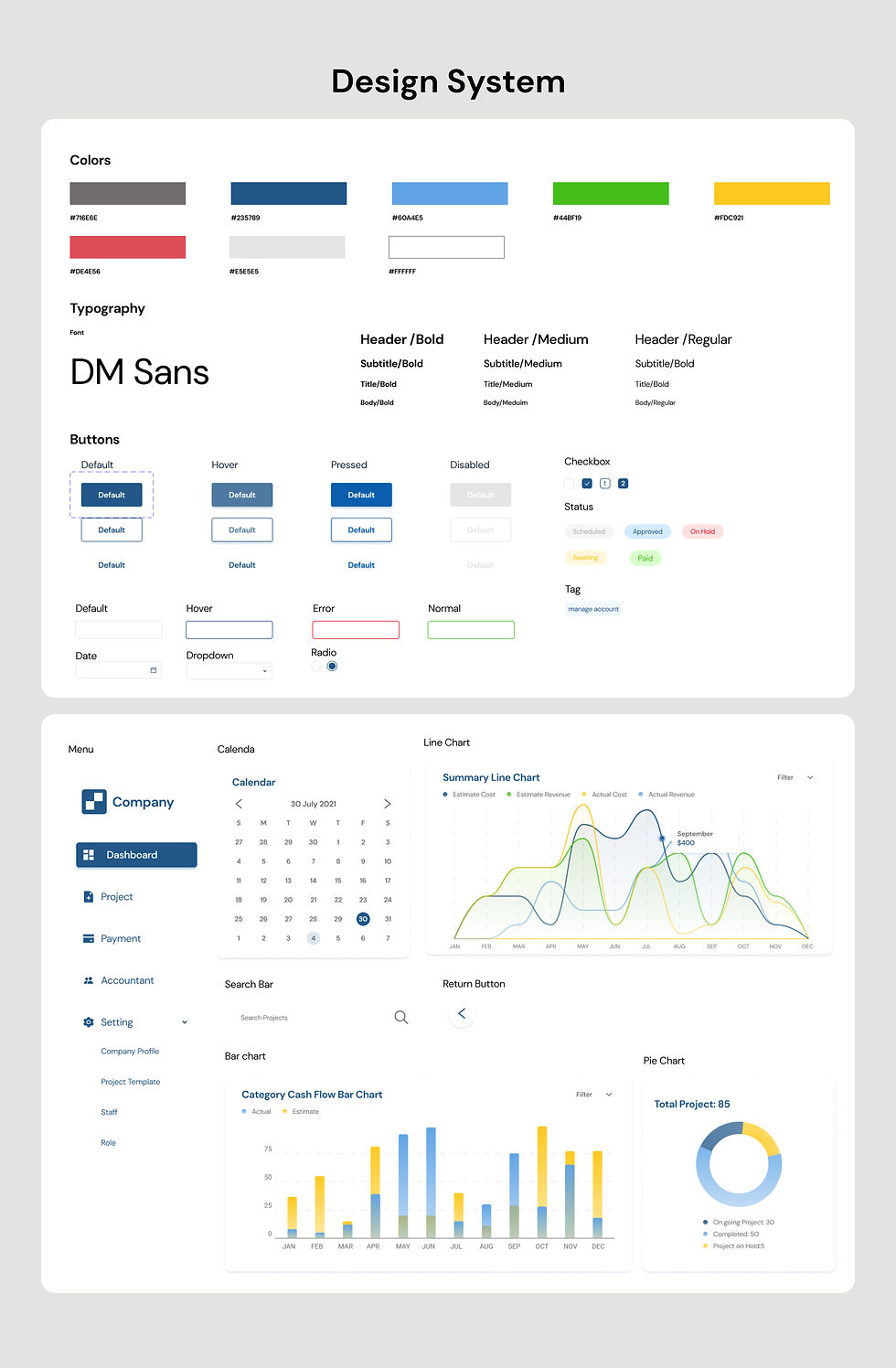
Next, I sketched low-fidelity wireframes with Figma to present our idea to the product owner. After we agreed on the general layouts of our screens, I started to design. Following is the design system I created from 0 to 1.
We invited 20+ users to test our high-fidelity prototypes and see how they think about the product. All of the users have given us as useful and meaningful feedback as they could. Highlights are below:
-
85% of users agreed that the import and create feasibility template feature will help them with version control of the feasibility reports. However, 20% of participants did mention some formulas in feasio are important for them to reference.
-
70% of users agreed on the payment process allows tracking recent expense status which is helpful when getting back to their clients.
-
One user did mention it’s better to discuss with accountants in order to define responsibilities between developers and accountants.

This project is the first SaaS system that I've worked on, and it's quite an interesting experience for me to explore how to design a simple but effective user interface with a design system.
I've learnt a lot from attempting to create a design system from 0 to 1 and using components did improve my productivity and simplify the whole design process, but maintenance of the design system is needed in the future.
Besides, I realised that a good visual sometimes does not contribute to user-friendly UX design. As UX designers, we need to be user-centred. For example, I included both expense and revenue when designing the monthly cash flow, considering it will be beneficial for accountants to manage payments. Unfortunately, this idea is useless because builders and developers will only receive revenue after the property is being sold in the construction industry.