Role - UI/UX Designer
Tools - Sketch, Zeplin
Tags - Landing Page, Responsive web
iShare Incubator is a co-working space based in Sydney, that provides collaborative communities with like-minded business professionals. As the company grows, my client wants to build up its professional brand image and boost website traffic through restructuring and redesigning its official website.
My Contribution
For this project, I was responsible for redesigning a responsive web user interface and providing. I was the only designer on this project so I was involved in everything from helping the client with planning all the way to delivering final designs ready for development.
Solutions

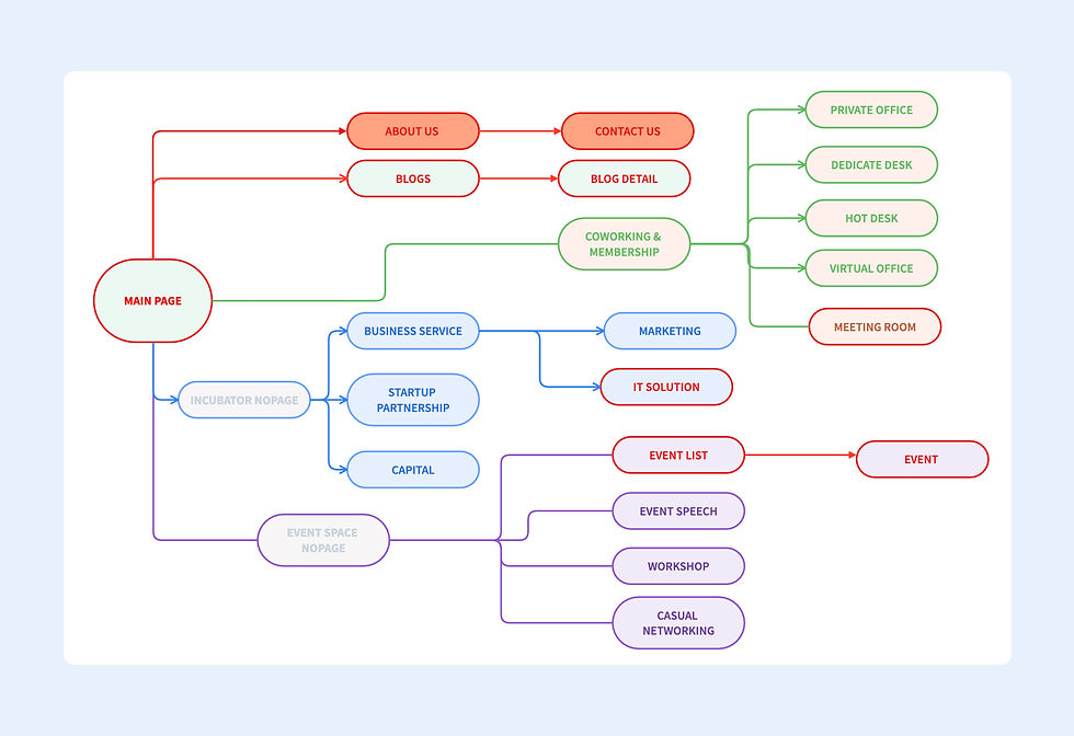
Website Structure
Website structure is restructured to the following with a multiple-level hierarchy, to enrich webpage content, and improve related search performance. Also, website usability is improved as users can have a clearer understanding of a structured website hierarchy.
Web Design
-
User Need
-
iShare aims to provide a collaborative co-working space to like-minded business professionals. This type of workspace is designed for small to medium-sized businesses to seek inspirational spirits and opportunities. Thus, a clean and modern business website is needed to represent iShare.
-
-
Colour Scheme and Style
-
Inspired by the company’s logo, I decided to use light blue with dark grey and white as the colour scheme. As blue can create a sense modern, it is widely used in various industries. To make our website more professional, it is necessary to match light blue with a darker colour and dark grey is used to keep the balance.
-
-
Design Elements
-
Buttons and container boxes are designed in a square shape with rounded corners to match the style of logo design.
-

-
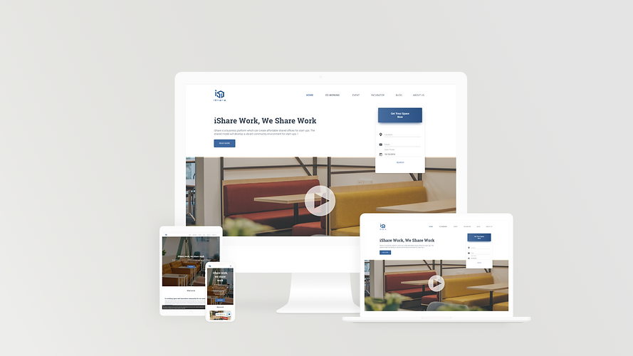
Responsive web
-
To create a more user-friendly and improve usability, I suggested the development team consider developing a responsive site, allowing users to visit the site through different devices.
-

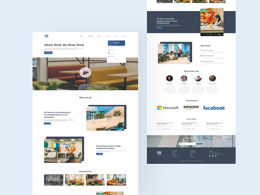
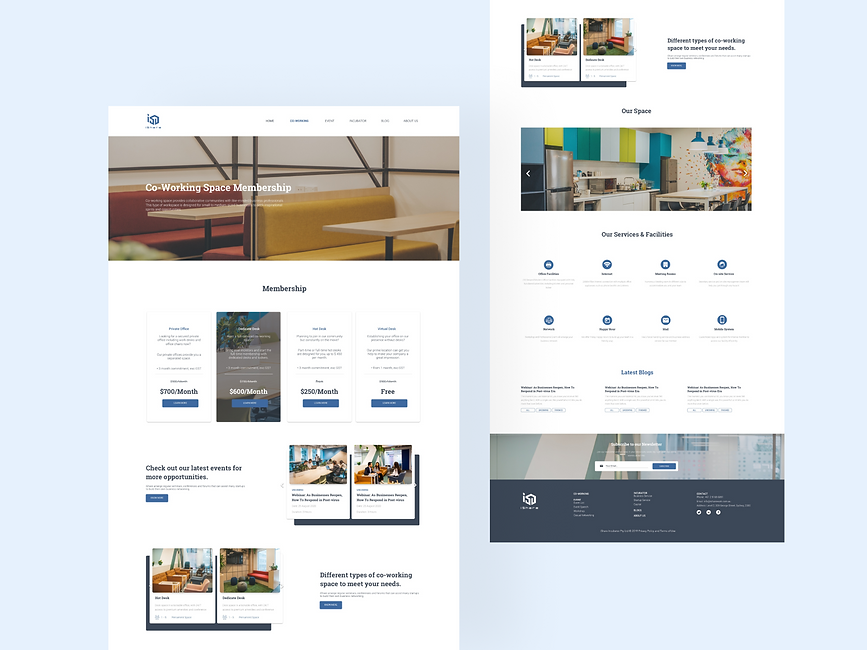
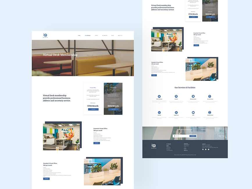
Final Design


Reflection
iShare Incubator is the first web design project I work as a freelancer. After redesigning the website, the site traffic of iShare increased by 35%. However, I still learn a lot from this project with its cons and pros.
-
Pros:
-
The overall design is clean and looks professional with a clear website structure.
-
The use of a rectangle pattern behind an image creates a sense of flexibility and the use of card components keeps consistency.
-
-
Cons:
-
When designing the website, I haven't think about the readability of the text, and it's quite hard to read when the paragraph is long.
-
Failed to apply 8X Principals when deciding margin and spaces, as it can contribute to a cleaner and tidier design.
-